
Learning Objectives
- Understand fundamental principles for organizing raw health data.
- Identify and correctly apply different types of tables for data presentation.
- Distinguish between various graphical displays and their appropriate uses.
- Recognize and avoid common errors in data organization and display.
- Appreciate the ethical considerations in presenting data visually.
Principles of Data Organization
Effective data organization is foundational for accurate analysis and meaningful interpretation in nursing research and practice. Key principles include:
- Data Dictionary: A crucial tool that describes variables, their definitions, and measurement units, ensuring consistency.
- Structure: Data should be arranged with one row representing each case (e.g., patient, event) and columns for each variable (e.g., age, diagnosis, intervention).
- Consistent Units: All measurements for a specific variable must use the same units (e.g., all temperatures in Celsius).
- Non-overlapping Categories: For categorical variables, each data point must fall into one, and only one, category.
- Missing Values: Distinguish clearly between genuinely missing data and a value of zero, as they carry different implications.
- Privacy: Always protect the privacy and confidentiality of individuals whose data is collected, especially when dealing with sensitive health information.
- Data Cleaning: Implement systematic processes to identify and correct errors or inconsistencies in the dataset.
- Reproducible Changes: All modifications to the raw data should be documented and reproducible to maintain data integrity and transparency.
Forms of Data Presentation: Tables
Tables are fundamental for summarizing and presenting data in a structured format.
Types of Tables
- Raw Data: The original, unorganized data collected.
- Ordered Arrays: Raw data sorted in ascending or descending order, useful for quickly identifying minimum, maximum, and range.
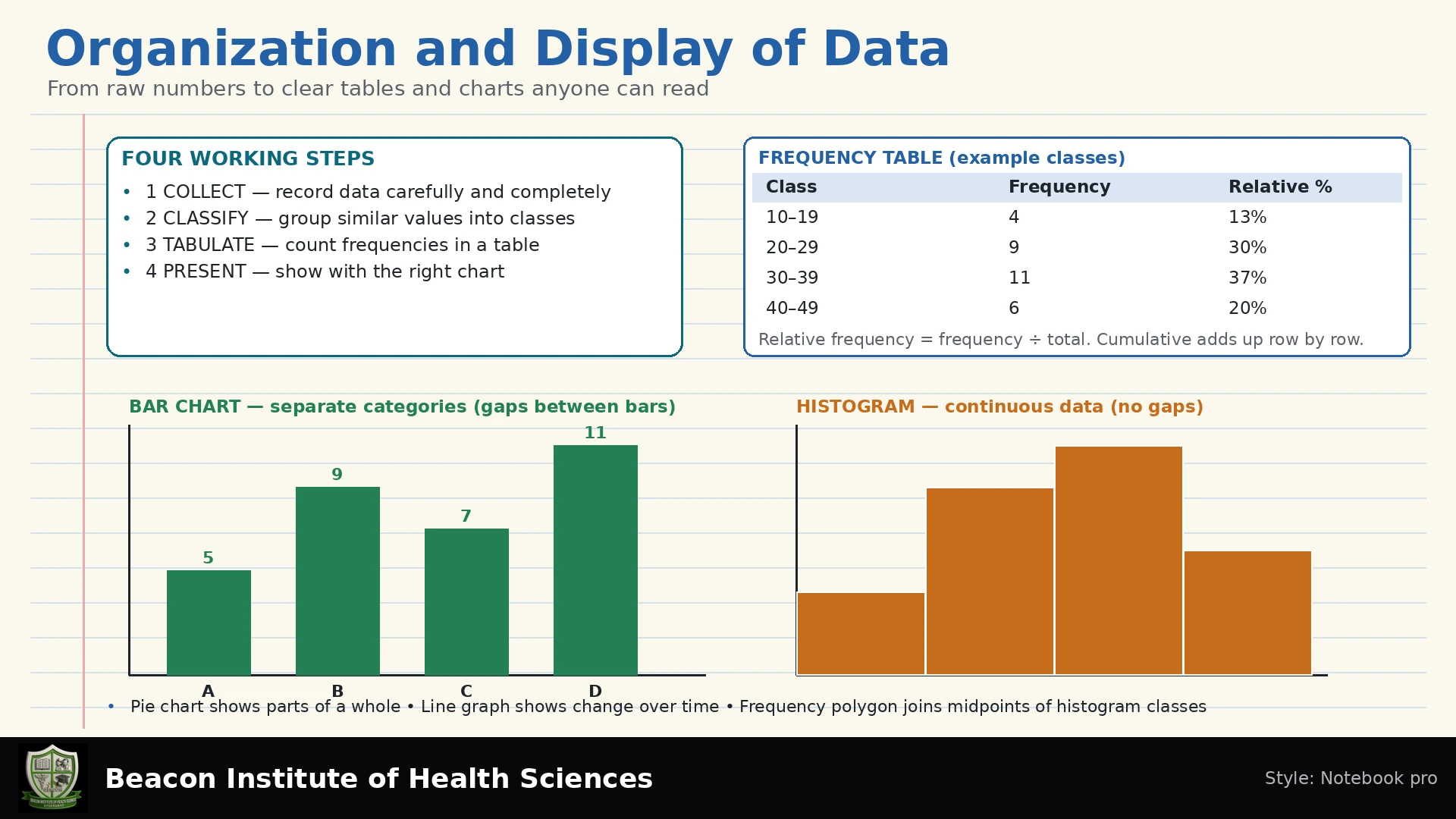
- Frequency Tables: List each category or value along with the number of times it appears (frequency).
- Relative Frequency Tables: Display the proportion or percentage of times each category or value appears, calculated as (frequency / total number of observations) × 100%.
- Cumulative Tables: Show the running total of frequencies or relative frequencies. These are meaningful only when the data can be logically ordered (e.g., age groups, symptom severity levels).
Best Practices for Tables
- Clear Titles: Every table must have a concise, descriptive title that explains its content.
- Period: Specify the time frame during which the data was collected.
- Population: Clearly define the population or group from which the data was drawn.
- Denominators: Always include the total number of observations (denominator) when presenting frequencies or percentages.
- Missing Notes: Provide notes regarding any missing values or exclusions.
Forms of Data Presentation: Charts
Graphical displays are powerful tools for visualizing patterns, trends, and relationships in data.
Specific Chart Types and Uses
- Bar Chart: Used for categorical data. Bars should have gaps between them to emphasize distinct categories.
- Histogram: Used for quantitative, continuous data. Bars (bins) adjoin one another, signifying continuity. Bins should generally have equal widths; if widths are unequal, the vertical axis should represent density rather than raw counts.
- Line Chart: Ideal for showing trends over time (time series data).
- Scatter Plot: Displays the relationship between two numerical variables. Each point represents a pair of values.
- Boxplot (Box-and-Whisker Plot): Summarizes the distribution of a numerical variable, showing the median, interquartile range (IQR), and potential outliers (based on a defined rule, typically 1.5 times the IQR above or below the quartiles).
- Pie Chart: Represents parts of a whole (100%). Categories must be mutually exclusive, and the chart should only be used for a limited number of categories. Avoid 3D effects as they can distort perception.
- Epidemic Curve: A specialized histogram used in epidemiology to show the number of cases of an illness over time, specifically by the date of symptom onset, not arbitrary time trends.
Ethical Considerations in Data Display
The ethical presentation of data ensures that visuals are transparent, accurate, and do not mislead the audience.
- Bar Charts: A fundamental ethical principle for bar charts is that the vertical axis (y-axis) representing counts or values should start at zero. This prevents exaggeration of differences between categories.
- Transparent Labels: If an axis does not start at zero for a legitimate reason (e.g., in some line charts to focus on variation), this must be transparently labeled and explained.
- Not All Charts Require a Zero Origin: While critical for bar charts, certain graphs, like line charts depicting fluctuations over time, may legitimately have axes that do not start at zero, provided clarity and context are maintained.
Synthetic Worked Teaching Example: Patient Wait Times
Let's consider a synthetic example of wait times for patients in a clinic (in minutes): 2, 4, 4, 6, 8, 10.
We will organize this raw data into a frequency distribution table with the following bins:
- Bin 1: 0 <= x < 5 minutes
- Bin 2: 5 <= x < 10 minutes
- Bin 3: 10 <= x < 15 minutes
Step-by-step calculation:
- Count: For 0 <= x < 5, we have 2, 4, 4. So, count = 3.
- Relative Frequency: (Count / Total Observations) * 100%. Total observations = 6.
For 0 <= x < 5: (3 / 6) * 100% = 50%. - Cumulative Relative Frequency: Add the current bin's relative frequency to the sum of previous bins' relative frequencies.
Wait Times Data Table (Denominator = 6)
| Wait Time (minutes) | Count (Frequency) | Relative Frequency (%) | Cumulative Relative Frequency (%) |
|---|---|---|---|
| 0 <= x < 5 | 3 | 50.0 | 50.0 |
| 5 <= x < 10 | 2 | 33.3 | 83.3 |
| 10 <= x < 15 | 1 | 16.7 | 100.0 |
(Note: Relative and Cumulative Relative Frequencies are rounded to one decimal place.)
Common Errors in Data Organization and Display
Nurses and educators should check to avoid common pitfalls that can lead to misinterpretation or incorrect conclusions:
- Incorrect Totals: Simple errors in summing frequencies or values.
- Overlapping Bins: In frequency distributions or histograms, bins must be mutually exclusive (e.g., using 0-5 and 5-10 is incorrect; it should be 0-<5 and 5-<10 or similar).
- Percent Base Mismatch: Using an incorrect denominator when calculating percentages, leading to inaccurate proportions.
- Confusion Between Counts and Rates: Presenting raw counts without accounting for the population at risk can be misleading. Rates (e.g., incidence per 100,000) provide better context for comparison.
- Failure to Protect Identities: Displaying data in a way that allows identification of individuals, violating privacy.
- Cannot Infer Causality: Correlation or association between variables displayed in a chart (e.g., scatter plot) does not automatically imply causation.
This systematic approach to organizing and displaying data is critical for BSN students to accurately interpret health information, conduct research, and communicate findings effectively in various clinical and public health settings.
Explore your understanding further with our quiz: Organization and Display of Data Quiz
Practice Questions and Explained Answers
- Where does a wait of 10 minutes belong? In the 10 ≤ x < 15 bin. The upper limit of the preceding bin excludes 10, so each observation is counted once.
- Which graph suits blood-group frequencies? A bar chart, because blood groups are separate categories. A histogram would imply numerical intervals.
- Why is cumulative blood-group frequency unhelpful? There is no inherent order to A, B, AB and O. A running total depends on an arbitrary arrangement rather than a meaningful threshold.
- Can two wards be compared using raw fall counts alone? Not fairly if exposure differs. Specify whether the question concerns people or events and consider an appropriate denominator, such as patient-days, alongside case mix and the observation period.
For the waiting-time example, a histogram with equal five-minute bins would have heights 3, 2 and 1. Label the horizontal axis “Wait (minutes)” and the vertical axis “Number of observations,” state n = 6 and identify the data as invented teaching observations.